After releasing Departure Board, I made the decision to not work on it over the first six months and gauge the commercial potential of the application in the market. In the first three weeks after the launch of Departure Board, I have had a lot of feedback from users requesting a couple of additional features beyond the simple initial release; primarily:
Filter by calling point.
The reason behind this was because many stations in the UK have a lot of service running from them all the time. Therefore to view their journey options the user would need to scroll through a long list of mostly irrelevant trains. A filter by calling point would remove all of these trains from the list, only showing the suitable ones.
Favouriting Boards.
Quick access to stations that are not your local station was another highly requested feature. Many people who commute into big cities seem to work away from the train station they commute into. Therefore a list of favourite stations was requested.
These were features that I always planned to add to Departure Board, if I saw sufficient commercial potential. However, it was clear that the addition of these two features would make Departure Board much more powerful and on par with the its competitors on the App Store. For this reason, I set aside 3 days in my calendar to add these features to Departure Board.
Before I rushed into this and potentially destroyed the simplicty and speed of Departure Board, I set out some requirements:
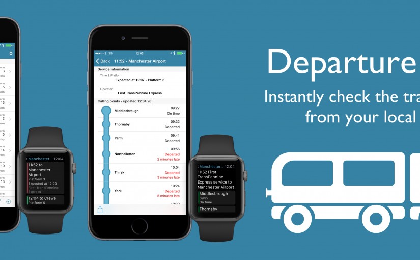
– Do not change current Departure Board philosopy: a departure board that loads instantly based on your location.
– Do not change the current user experience; one tap departure board.
– Including filtering by calling point as an option extra and never as a prompt to the used; preserving UX and speed.
– Favouriting will include any arrival/departure status and filtering on the current board.
– Favourite Stations will be accesible from Watch.
I started by making the required changes to my backend: database schema change and migration to include favourites and change to API data retrieval class to allow filtering by calling point. Once this was done, the next job was to update the UI to reflect these new changes. I really didn’t want to increase the complexity of the UI by adding a lot of extra buttons so at first I hid all the extra features behind a star button in the top tight hand corner, which worked well enough, but it wasn’t great.

I sent this build out to my beta testers and most mentioned that they would not have expected to see filtering when you tap on the star button. I considering changing the icon, but I didn’t think this was sensible, as this button gives context whether this station was a favourite or not.

Therefore, I re-ordered the icons in the toolbar (segment button on the left) and gave filtering its own button (with state) in the UI, this was much neater and made the UI much more intuitive.

I reflected these changes in the watch utilising the Force Touch menu to switch between Nearby and Favorite station.
This fulfilled my requirements and the testers all agreed that it was a really great improvment to the functionality of the App with an intuitive UI.
These new features will be available very soon (version 1.1), once the update is approved by Apple.